

We didn’t realize this at first.
We thought the problem was translation.
It wasn’t.
It was the menu itself.
Most restaurant menus were never designed to be understood.
They were designed for print.
Small fonts, tight spacing, lots of items squeezed onto one page.
It looks “complete,” but not necessarily clear.
That worked when people were already sitting at the table.
But now?
People check menus on Google Maps.
They search before they walk in.
They even ask AI what dishes mean.
And yet, the menu hasn’t really changed.
So we did what most people do.
We started using AI to figure things out.
Taking photos of menus.
Copying dish names.
Pasting them into ChatGPT and asking:
“What is this?”
“Is it beef or pork?”
“Is this something I’d actually like?”
And honestly — it worked better than we expected.
But the whole process felt… off.
Why were we doing all this just to understand a menu?
Today, most restaurant menus fall into two categories:
static menus (PDFs, images) and transactional menus (POS or ordering systems).
Some restaurants have already gone digital.
QR code menus.
Online ordering pages.
POS-generated menu websites.
On paper, that sounds like progress.
But once you use them, you notice something.
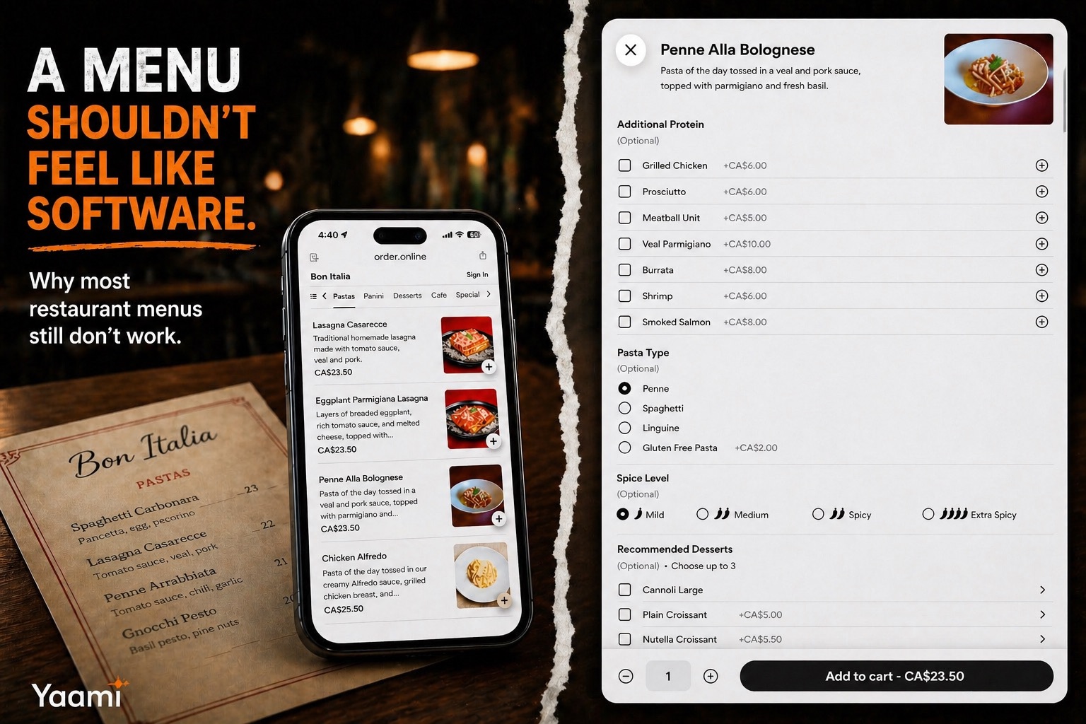
They’re not really built to help you understand the food.
They’re built to help you place an order.
You’re not reading — you’re navigating.
Tap. Scroll. Add. Remove. Customize.
Even something simple — like switching noodles in a spicy beef ramen —
turns into a small workflow.
It works, technically.
But it doesn’t feel natural.
And there’s another thing.
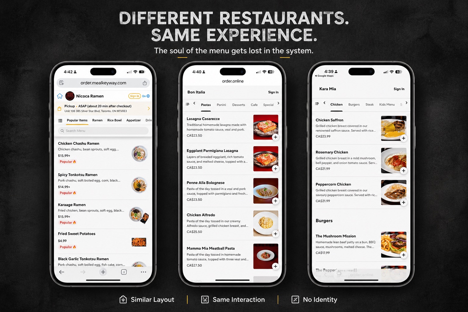
These systems tend to look the same.
Same layout. Same buttons. Same structure.
It doesn’t matter if you’re looking at an Italian restaurant or a small noodle shop —
the “menu” starts to feel like software.
Clean, efficient… but kind of lifeless.
Which is strange, if you think about it.
A menu used to be part of the restaurant.
The typography, the layout, even the wording —
it all said something about the place.
Now, that layer is mostly gone.
So we ended up in a weird place:
Paper menus are hard to understand.
Digital menus are easy to operate, but not easy to connect with.
Neither really matches how people choose what to eat today.
A menu shouldn’t feel like a tool you have to figure out.
It should just make sense.
To you — and increasingly, to AI as well.
That’s when we started to rethink
what a menu is supposed to be.