

Most restaurants are solving the wrong problem
Somewhere along the way, restaurants started to believe this:
If customers can order online, they can see the menu.
But that's not true. Ordering is not browsing.
And a checkout flow is not a menu.
If you've ever wondered why so many restaurant menus feel frustrating to use, we explored that in detail in our previous article Why Restaurant Menus Still Don't Work
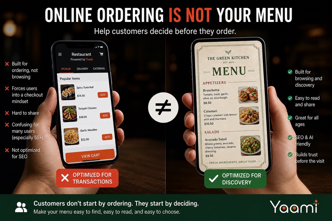
The mistake: using an ordering storefront as your menu
Many restaurants today don't really have a standalone online menu. Instead, their website or Google profile sends customers to:
- a Toast ordering page
- a DoorDash or Uber Eats storefront
- a Grubhub menu
- a so-called "storfront" link generated by POS system like Lightspeed, Gosnappy, etc.
This creates a real problem.
These pages are built for people who are ready to order.
But many visitors are not ready yet. "Why do I need to sign in just to see the menu?"
They are still deciding.
What customers actually want
Before they visit, customers don’t want to order.
They want to:
- See what dishes you serve
- Understand the dishes
- Decide if it’s worth going
That’s it.
No login.
No cart.
No commitment.
POS and delivery storefronts are not designed for browsing
POS systems and delivery platforms are built to complete transactions.That is their job.
So when a restaurant uses a POS ordering page or delivery storefront as its main online menu, the menu becomes part of a checkout flow.
That changes the experience:
- Customers are pushed toward pickup or delivery
- The interface is organized around carts and checkout
- Some users may need to choose an order type or sign in
- The page feels like a transaction, not a menu
For customers who only want to browse, this feels annoying. For some, especially older customers, it can be confusing.
Worse than a PDF?
Surprisingly, yes.
A simple PDF menu may not be perfect, but:
- It’s easy to open
- Easy to scroll
- Easy to share
There’s no pressure to “order.” That’s why many people still prefer it over ordering interfaces.
The hidden cost: lost customers before they arrive
Here’s what often happens:
- A customer finds your restaurant
- They try to check your menu
- They land on an ordering page
- It feels confusing or annoying
- They leave
No one tells you this happened. But it happens all the time.
This is not a problem with online ordering
Online ordering is valuable. It increases convenience. It drives revenue. That’s not the issue.
The problem is using an ordering storefront as the only public menu.
Your menu is not a checkout tool
It’s a decision tool.
And it lives at a completely different moment:
Before the customer decides to visit.
If your menu only exists inside a checkout flow, you’re optimizing for the wrong stage.
The SEO problem no one talks about
There’s another issue.
When your menu is locked inside POS or delivery platforms:
- Search engines can’t read it properly
- Dish names aren’t indexed
- You lose long-tail discovery (e.g. “spicy ramen near me”)
Meanwhile, a proper menu page:
- Adds searchable content
- Helps Google understand your restaurant
- Improves visibility over time
Your menu should be one of your strongest SEO assets.
Instead, most restaurants give it away.
Two audiences, not one
Today, your menu has two readers:
- Humans
- AI (Google, ChatGPT, assistants)
Both need:
- Clear structure
- Readable content
- Context
A screenshot, a PDF, or an ordering UI doesn’t solve this well.
A simple rule
If someone can’t easily read your menu without ordering,
you don’t really have a menu.
Where this is going
We’re starting to see a shift.
Restaurants are realizing:
- Ordering systems ≠ menus
- Menus should be lightweight, readable, and shareable
- Visibility matters before conversion
That’s where tools like Yaami.ai come in.
From photo → decision-ready menu
With Yaami, a menu is no longer trapped inside a PDF or a checkout flow.
You take a photo.
And in minutes, it becomes:
- A clean, mobile-friendly menu
- Easy to browse and share
- Structured for search and AI
Not for ordering. For deciding.
Because that’s where the real conversion starts
Before the order.
Before the visit.
At the moment someone asks:
Should we go here?